
Started in a ghost kitchen for delivery only, TAKOREA has a new home in their own brick and mortar restaurant.
The rebrand is an opportunity to make a splash as they introduce their food to the neighborhood.
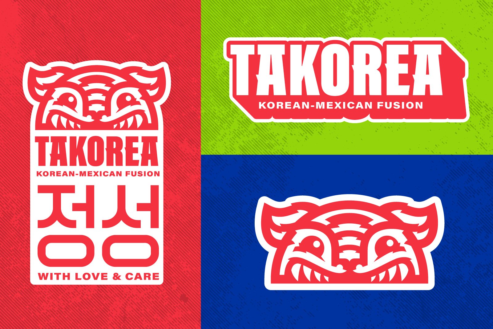
In a sea of restaraunt logos based on the Korean Flag (including their own), we decided to take a different approach.


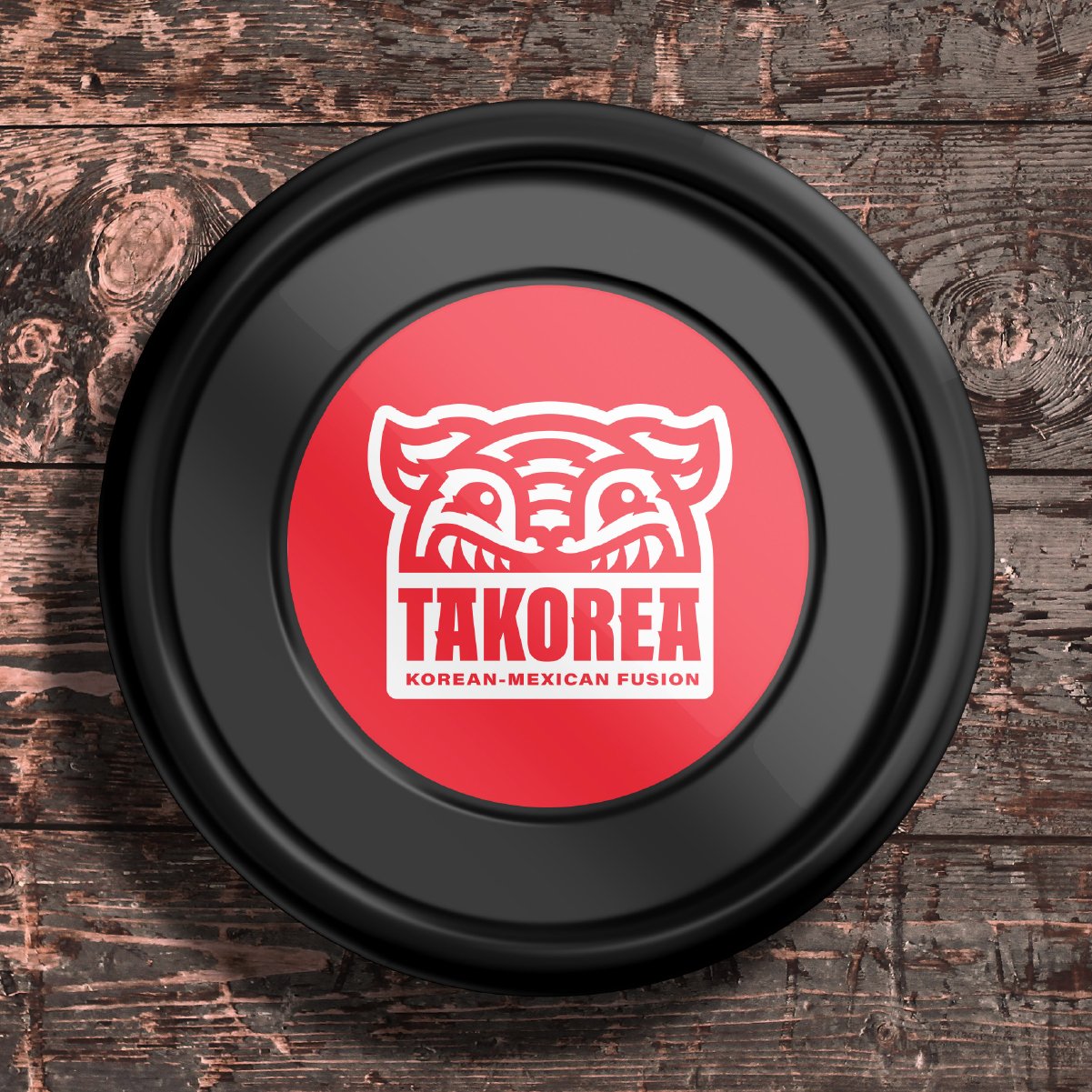
BIRTH OF THE TAKO TIGER

Something Familiar
The tiger’s head is depicted in the recognizable shape of a taco (or “tako” in this case). It symbolizes the fusion of traditional Korean flavors and fresh ingredients with the shape of traditional Mexican faire.

Something Wild
The tiger is strongly associated with Korean culture and is seen as representative to the identity of Koreans. Tigers in Korea are a symbol of strength and power and often seen as the guardian spirit and protector of the Korean people. Tigers are often featured in many Korean folktales and stories.

Something Traditional
Traditional Korean ornamentation is unique in Asia as it relies on circles, mono-weight lines and symmetry. We considered these traits as influence for how we rendered the logo.

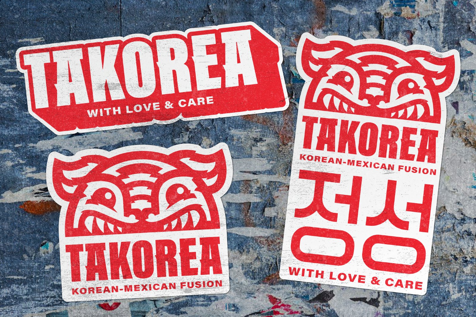
Make it your own
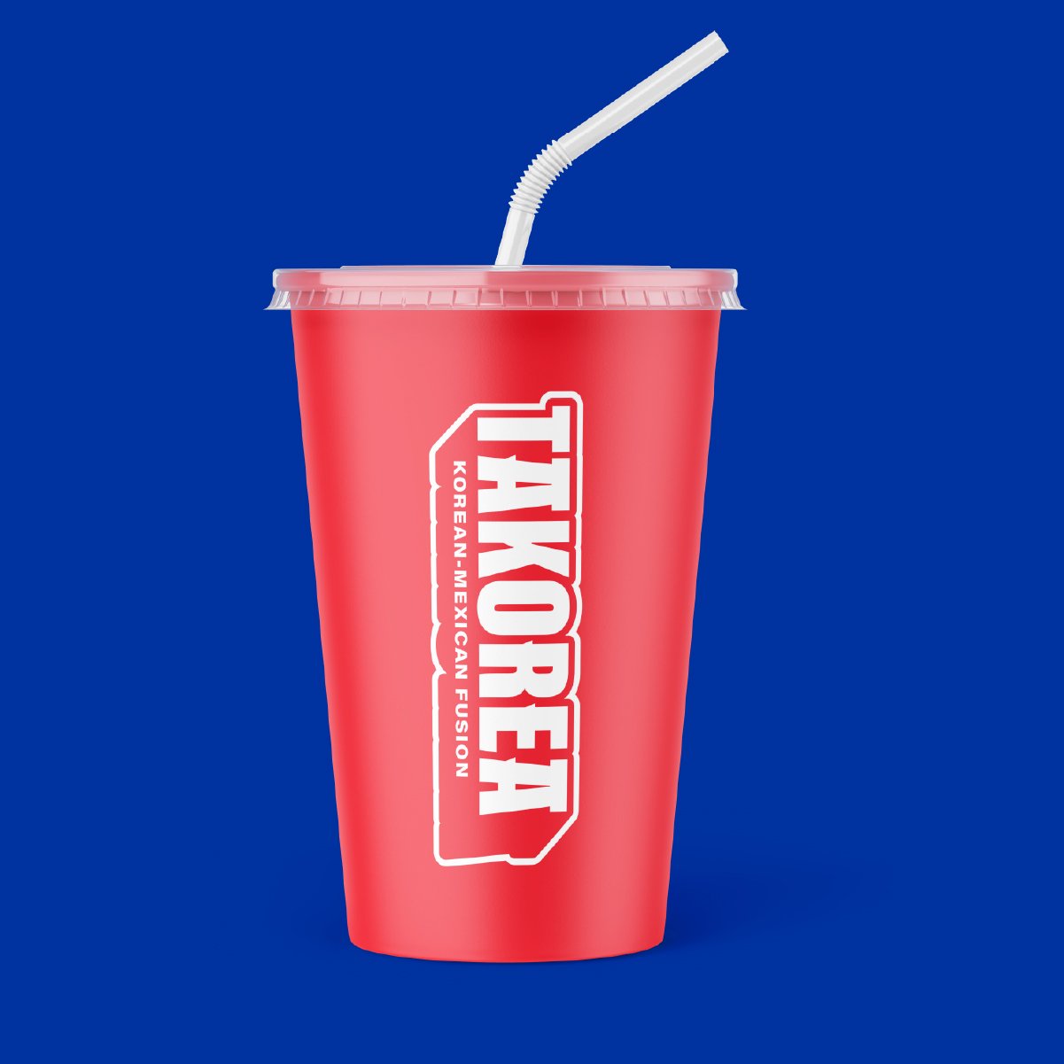
TAKOREA’s food starts with the freshest ingredients but you get to choose how it all comes together.
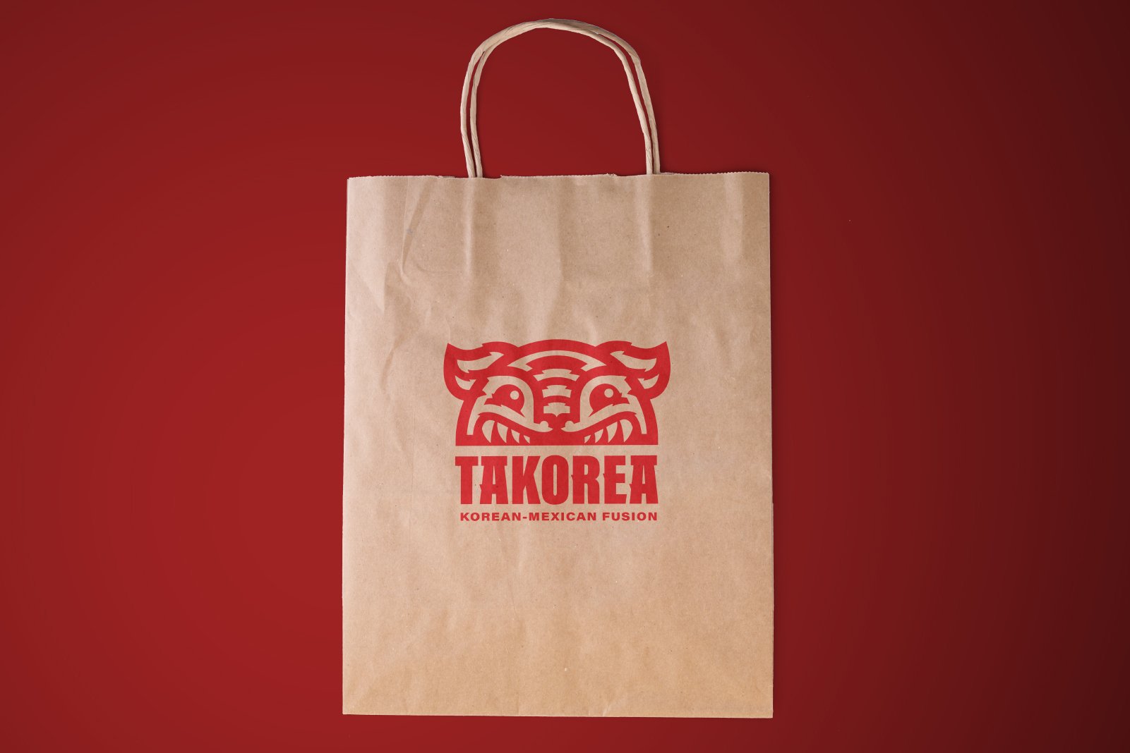
You get to make it your way. There’s nothing that says “make it yours” like stickers. You see them on laptops, car tailgates and wrapped around your favorite Thermoflask. You can tell a lot about a person by what stickers they choose to identify with. Creating stickers from the logo also cuts down on waste and gives TAKOREA a way to customize existing sustainable packaging in a cost-effective way.


